Create color schemes with complementary and analogous colors.
Use color meaning to evoke emotion or direct attention.
Typography Fundamentals
Font selection, spacing, and line height.
Readability across devices.
Use clear and legible fonts for better accessibility.
Adjust line height and spacing for comfortable reading.
Avoid using too many font types to ensure consistency.
Opt for responsive typography that scales well on different screen sizes.
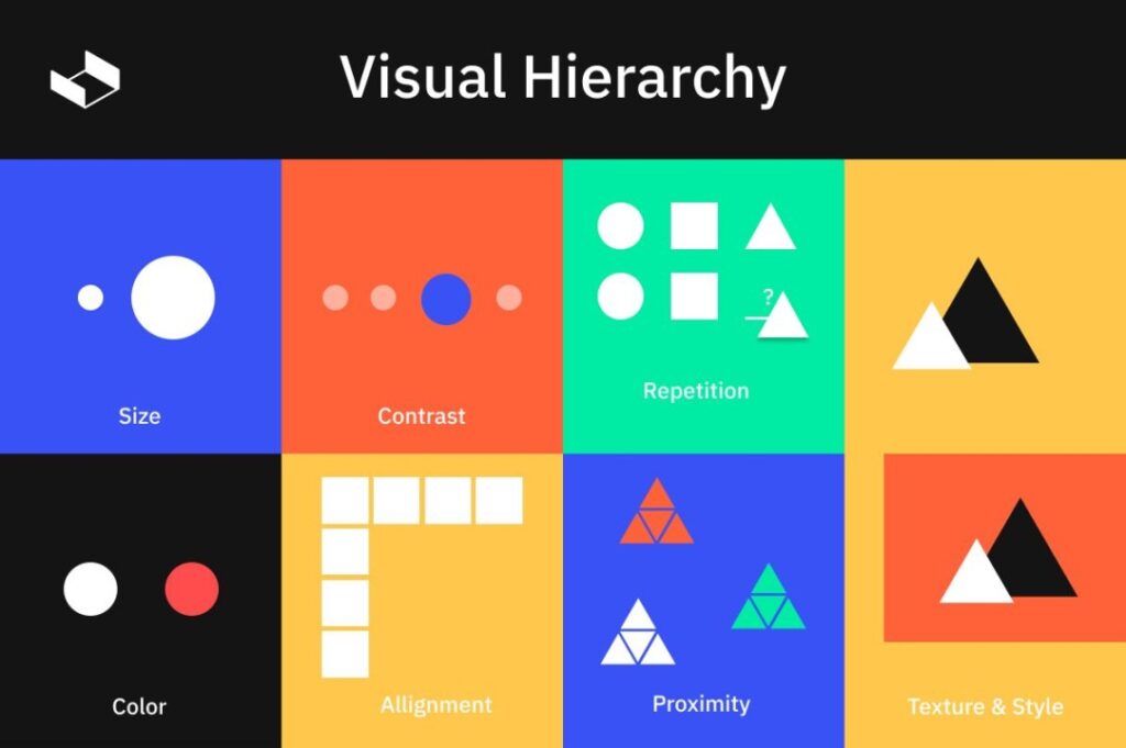
CRAP Principles
Contrast: Differentiate elements for clarity.
Repetition: Maintain consistency in design.
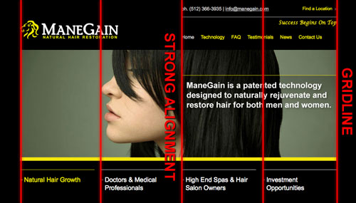
Alignment: Position elements deliberately.
Proximity: Group related items together.
Examples of CRAP in Action
C
R
A
Balancing Aesthetics and Usability
Combine visual hierarchy, color theory, and typography.
Keep CRAP principles in mind to maintain clarity.
Ensure accessibility is not overlooked for aesthetic choices.
Responsive Web Design
Ensures websites adapt to different screen sizes
Improves user experience on all devices
Uses flexible layouts, images, and media queries
Key Concepts
Fluid Grids
Use percentage-based widths instead of fixed pixels
Flexible Images
max-width: 100%; height: auto;
Media Queries
Apply styles based on screen size:
@media(max-width:600px) { body {background-color:lightgray; }}
What is CSS?
CSS (Cascading Style Sheets) is used to style and layout HTML elements.
It controls colors, fonts, spacing, positioning, and responsiveness.
Works alongside HTML:
HTML provides structure.
CSS provides style and layout.
How CSS is Applied
Inline CSS (style attribute in an element).
Internal CSS (<style> tag in <head>).
External CSS (linked .css file).
/* Example External CSS */h1 {color:blue;font-size:24px;margin-bottom:10px;}
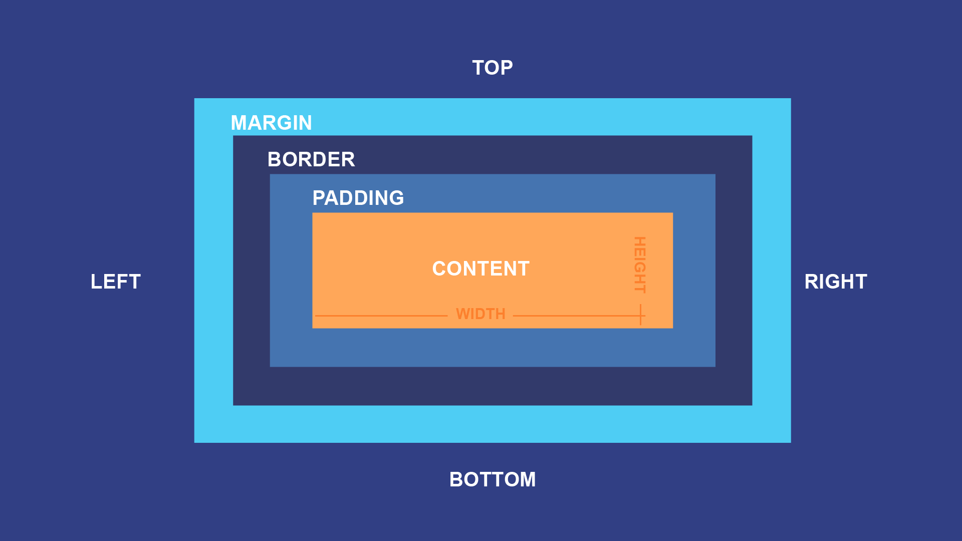
The CSS Box Model
Every HTML element is a rectangular box with four key parts:
- Content: The actual text, image, or element.
- Padding: Space between content and border.
- Border: The outline around the padding and content.
- Margin: Space outside the border, affecting separation from other elements.
The CSS Box Model
Box Model Diagram
box-sizing affects how the width/height of elements is calculated:
content-box (default): Width excludes padding and border.
border-box: Width includes padding and border.
CSS Units
Absolute:px (fixed size)
Relative:em, rem (based on font size), % (relative to parent)
Viewport-based:vh, vw (based on screen size)
Margin Collapse
When two vertical margins meet, the larger one takes effect instead of stacking.
Fixes: Add padding, border, or overflow: hidden to elements.