Introduction to Design Language
This week, we meet a few design terms that help us both:
- appraise design qualities of a given web property
- understand which to employ and how to use them in our sites
Learning Objectives
Section titled “Learning Objectives”This lesson achieves learning objectives:
- Design front-end user experiences using accepted web design patterns, methods, and information structures.
- Identify and use strategies of successful visual rhetoric for the web.
Hello Web Design, Chapter 2 + 3
Alignment
Section titled “Alignment”The way that the different elements in a design are arranged, usually in relation to a page or document.
A system of horizontal and vertical columns and guides used to provide structure, consistency, accuracy in any design. Grids allow for vertical and horizontal alignment, calculated for the designer by the web browser; it’s set and forget!
Balance
Section titled “Balance”Distribution of visual assets by “weight” to create design
symmetry,asymmetry, orradial symmetry.
Symmetry
Section titled “Symmetry”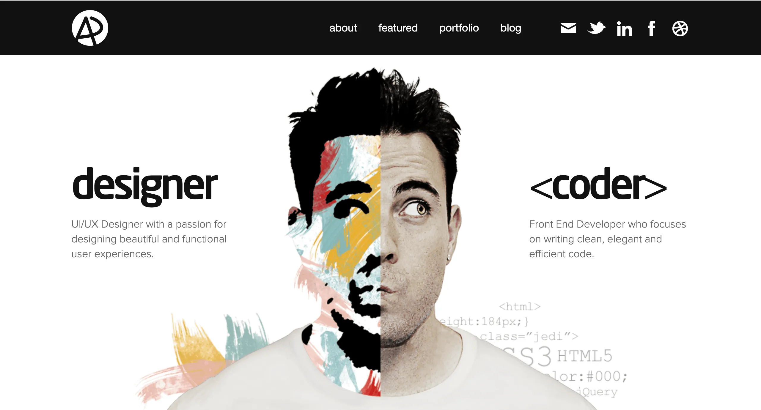
Symmetrical balance distributes page elements at roughly equal distances and hierarchies. When document
correctly, the distribution of items can create stunning visual effects.
Asymmetry
Section titled “Asymmetry”
Asymmetrical positions elements of different “weights” to create a sense of hierarchical contrast, where
specific elements gain more prominence and attention.
Radial Symmetry
Section titled “Radial Symmetry”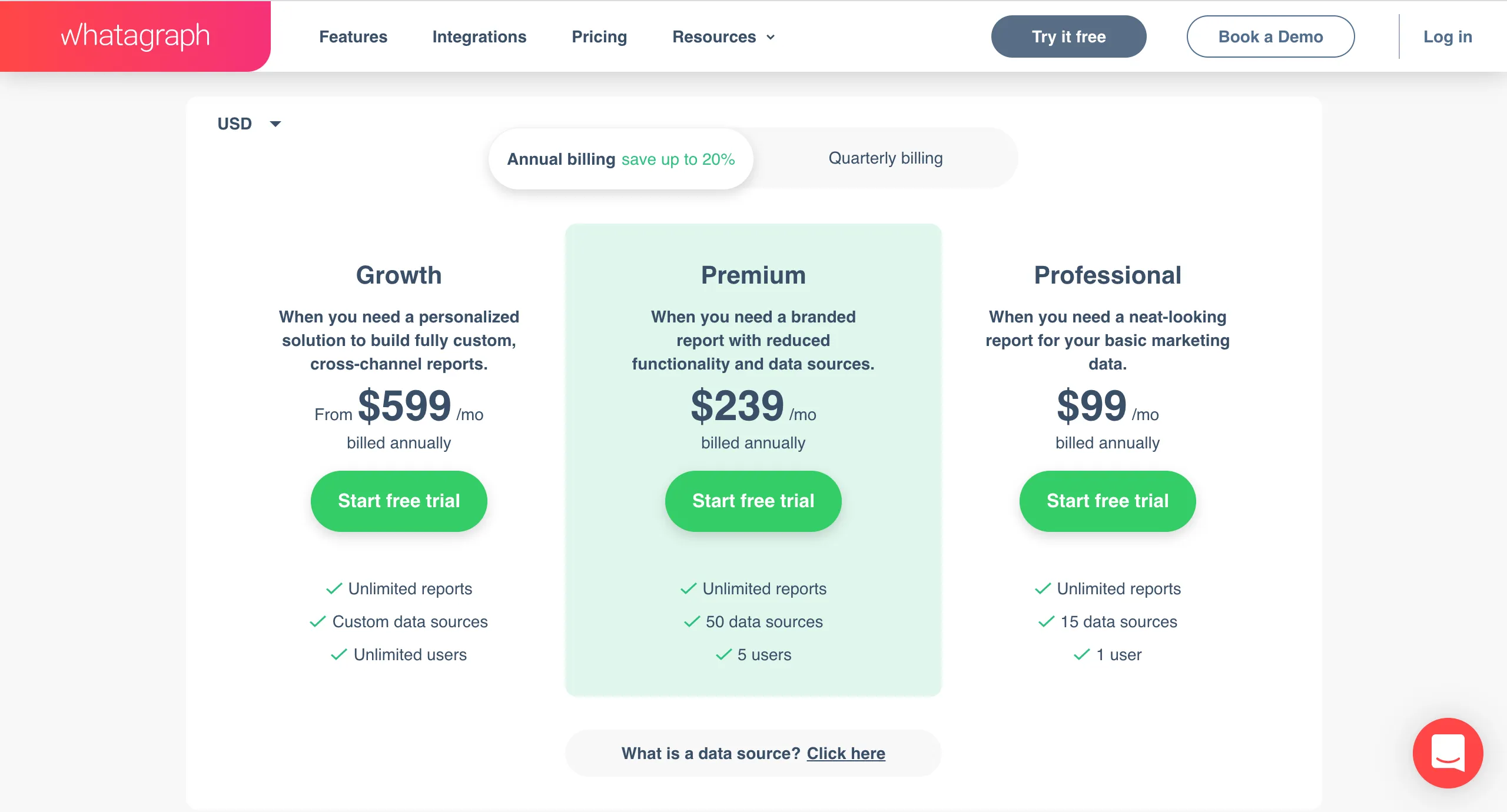
Radial arrangements call attention to a central element which may be flanked by other elements designed
to attract visual attention to a specific spot on the screen.
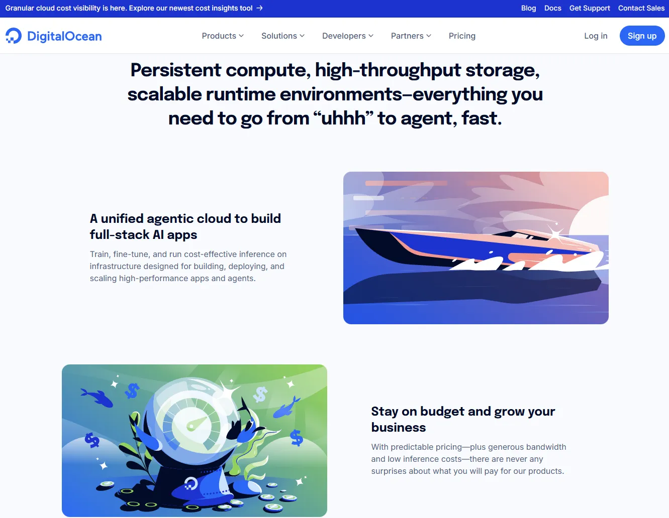
This design leverages a the layout to draw customer attention to the seller’s optimal outcome: the plan they want the customer to sign up for, though there are other options.
Cohesive combination of layouts, shapes, colors, typefaces, and fonts that offers as sense of consistency to a design, elements working togther to support the entire design.
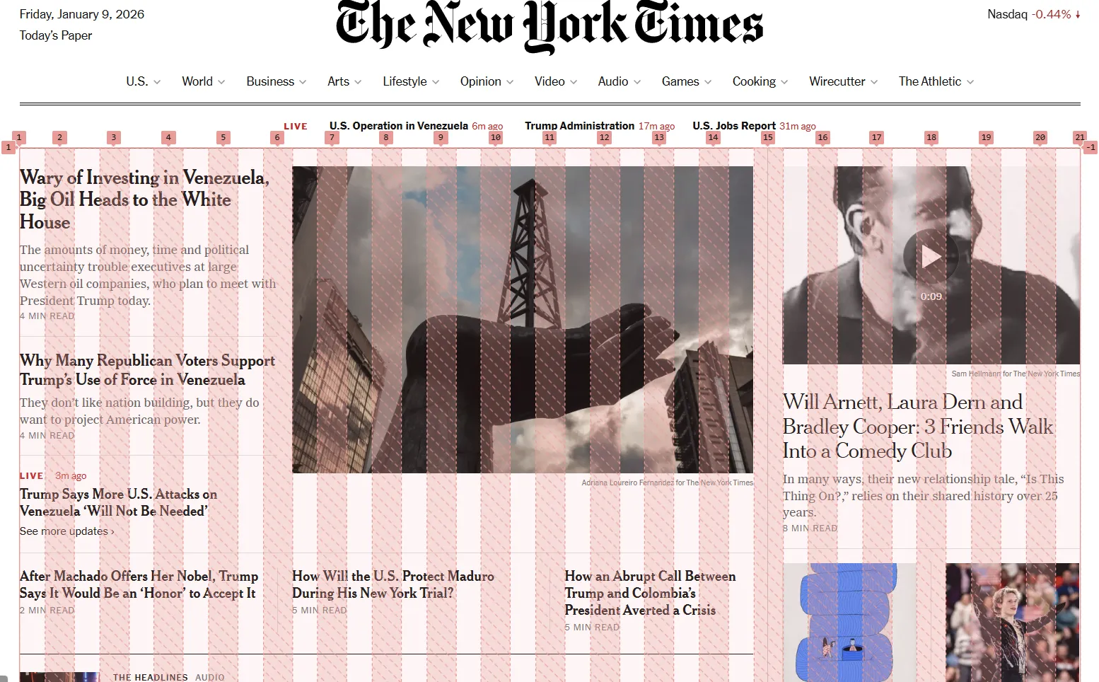
Visual Hierarchy
Section titled “Visual Hierarchy”Use of item weights to direct user attention to specific areas of a page or a block of text.
Reconsider our example of Radial symmetry and consider the most important information on the page.
In what ways does this image demonstrate hierarchy of information through design elements?
Negative Space
Section titled “Negative Space”Another name for “white space”; space between elements not populated by design elements. Many designers describe negative space as space for “breath.”
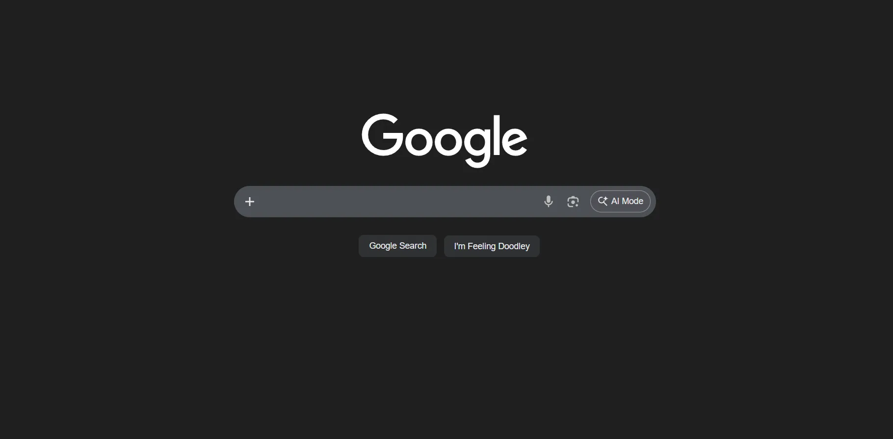
Think about this familiar page. How does Google use negative space to instruct you and keep your focusing on the purpose of the page?
Color Theory
Section titled “Color Theory”The use of color to shape understanding and influence perception.
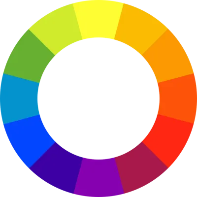
The typical color space is made up of Red, Green, and Blue color values, hence the RGB
designations that describe colors, typically seen in “hex” format (e.g., #FB9802, which results in
the color ).
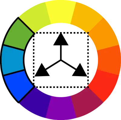
Color Palettes
Section titled “Color Palettes”Designers use various relationships between colors to define color palettes which constitute
one way to introduce unity and hierarchy to a site design. For example, designers may use:
- Analogous palettes:
- Triadic palettes:
- Quarternary palettes:
Typography
Section titled “Typography”Use of arranging type to legibly display written language.
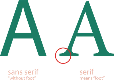
While several more different types of typefaces exist (mono-space, slab serif, script, et al.) the serif and sans serif
varieties are the most likely you’ll encounter.
Typically:
- sans serif typefaces make paragraphs much more legible due to sharper distinctions
- serif typefaces make for good “heading” type
- while these rules are a good starting point, appropriate spacing and accompanying design often dictate ease-of-reading